We are Hiring
Alhuda Software House.
Women University, 1st Floor Noor Plaza Opposite, Kutchary Rd, Mohalla Qadirabad, Multan, Punjab 58000
0300 8829545


A creative and beautiful landing page is one of the most important part of your website. Landing pages are a powerful tool, whether you want to generate leads , sell online or increase your mailing list. An attractive designed landing web page with a beautiful call to action buttons can create a great difference.
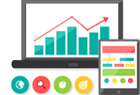
Importance of beautiful landing page
At Alhuda, with professional graphic and web designers, we assure you for attractive and 100% optimized Landing page service in islamabad Rawalpindifor your business. Unlike, other duplicate landing page designing companies, we make your landing page according to your business requirements, color theme as per your logo. We focus on ensuring the best results to achieve best result for you.
As defined by Unbounce, “a landing page is a standalone web page created specifically for the purpose of a marketing or advertising campaign.” Unbounce also states that landing pages are designed with a single goal in mind, known as a call to action or CTA.
Landing pages are used at different stages of the entire inbound marketing cycle. Landing pages can help you achieve your goal at every stage of the buying process, from introducing your brand to users in your target market to converting a lead into a paying customer.
To fully understand the concept of a landing page and its benefits, it is important to understand what is not considered a landing page.
Most marketers don't consider homepages and related web pages on the web to be landing pages. The reason is the defined purpose of these pages. For example, a home page is not traditionally designed with a single call to action in mind. Instead, the intent of the home page is to introduce the site/brand to the visitor and show them what content they can access. It offers visitors multiple navigation paths and does not have a designated call to action.
Landing pages help marketers achieve a variety of objectives. As a result of numerous marketing goals, there are multiple types of landing pages one can use in their marketing campaigns.
Lead generation landing pages seek to turn a targeted website visitor into a lead for your business by capturing personal information such as:
With this information, your company can work to convert that lead into a customer. This type of landing page can be used to build email subscriber lists, funnel users through the inbound marketing cycle, or increase the number of sales for a given time period.
Click-through landing pages present information about a discount, promotion, or offer with the intent of convincing the user to purchase right away. These landing pages tend to be simple in nature and are used later in the buying cycle.
Also known as infomercials or long landing pages, this type of landing page relies on a large amount of content to entice the user to take action or take the next step. Rather than relying on flashy sales copy or graphics to attract users, these landing pages work much like infomercials by presenting a wealth of benefits, features and compelling copy that educates users.
These landing pages are ideal for campaigns that require users to provide detailed personal information or make a large purchase, such as promoting an educational course or expensive product/service.
Often used in retail, product detail landing pages provide visitors with all the information about a product. Many retailers will simply focus their marketing efforts on these regular pages of their website, while others will create campaign-specific pages with limited navigation and distraction.
The intention of these pages is to bring interested users directly to the product and convince them to make a purchase on the spot.
Of course, these are just a handful of landing page formats available to marketers. Deciding which type of landing page to use depends on the marketing tactics used and the overall goal of the campaign.
Marketers aim to drive visitors to landing pages from other areas of the Internet to these pages using several tactics. The intent and type of landing page chosen is determined by the tactics used, such as:
Pay-per-click advertising, or PPC, refers to when marketers pay each time someone clicks on their ad. PPC ads are commonly used in search engines like Google and Bing. If your brand or business invests in pay-per-click advertising on search engines or display marketing on related websites, you need optimized landing pages.
For example, if you're running a PPC advertising campaign for your latest product, you wouldn't send clicks to your website's homepage. Instead, you would create a single page (landing page) designed to entice users to buy your new product immediately.
Similarly, you can invest in pay-per-click advertising on social media channels such as Facebook, Instagram and Twitter.
Landing pages can be used in online marketing strategies that also focus on organic traction on social media. A good example would be promoting an e-book to generate leads. From an organic social post, drive visitors to a landing page where they can submit their information in exchange for exclusive content.
As the Content Marketing Institute states, “content marketing is a strategic marketing approach focused on creating and distributing valuable, relevant, and consistent content to attract and retain a clearly defined audience—and ultimately drive profitable customer action.” With this in mind definition, landing pages can be used to introduce content to a target market, capture their attention and information, and convince them to become a customer later in the process.
For example, your brand could create a library of useful resources as part of a larger content marketing plan. Naturally, you would want your market to take advantage of these resources. To access this exclusive content, require users to enter their email address in the landing page form. You've then converted the visitor into a lead and can now continue to provide useful content throughout the buying cycle.
Once you have a visitor's email address, you can send them relevant content, offers and information through email marketing. Landing pages are incredibly useful tools for these messages as well. If you're sending subscribers an exclusive offer, use a landing page!
A landing page can be a designated page that you are taken to after clicking on an ad. It can also be the page that follows the call-to-action button, or it can serve as the website's home page.
Regardless of how you "land" on the landing page, the purpose of the landing page is to encourage you to convert to a prospect or customer. For this reason, landing pages are uniquely powerful components of a company's digital marketing strategy.
A landing page is a web page with a specific purpose – the goal of a landing page is to convert visitors into potential customers. While there are many types of landing pages, the intent is the same – to get more leads.
Landing pages contain lead forms that ask visitors for their contact information in exchange for something of value, otherwise known as an offer.
Why would you create a special page just for people to fill out a form? Why not use your homepage or about service page? Great questions.
After reading this article, you'll probably be able to answer these questions yourself, but the short answer is this: A landing page removes distractions by removing navigation, competing links, and alternative options, so you get the visitor's full attention. And full focus means you can lead the visitor where you want them to go, which is to your lead form. In short, landing pages are specifically designed to generate conversions.
For every 10 people who visit your landing page, at least seven of them will return from the page. To keep that number low, your visitors need to know (and understand) what it means to them within seconds of arriving. Your headline is the first thing they read and should clearly and concisely communicate the value of your landing page and offer.
Yes, an image is required and should represent your target audience. The purpose of your image is to convey a feeling – it should illustrate how your visitor will feel once they receive your offer. Some images may work better than others, so you should always split test your options.
Don't waste all that time crafting the perfect headline and searching for the ideal image to fall short when it comes to the words that will actually sell your call to action. Your copy needs to be clear, concise and guide the visitor to the action you want them to take. Impactful copy also speaks directly to the visitor using “you” and “your” to make them feel engaged. We'll take a closer look at copying tips below.
Your lead form needs to be easily accessible if your prospect wants to convert right away – you definitely don't want them to be searching and scanning your landing page to find your offer. "Above" just means that visitors don't have to scroll to get to the form - that it's visible as soon as someone lands on the page. It can be a form or an anchor link to a form. Even better: Design your form to scroll with the user as they scroll down the page.
A call to action (CTA) is probably the most important element on your landing page – it's one of many elements that drive conversion. The CTA button needs to stand out, which means you should use a color that contrasts with other elements on the page. Be clear about what you want your visitors to do, that is, use an action verb to explain it to them, such as "send", "download" or "get now". More on CTA best practices below.
Think of your landing page as part of a prospect's journey to your final offering—your product or service. Your offer is the thing you provide in exchange for your prospect's personal information. Not only should it be compelling enough for your visitor to enter their contact details, but it should also be relevant to your business. Let's say you sell horseshoes.
Your offer might be something like "10 Easy Ways to Adjust Your Horse's Hoof Size" because you'll end up asking the lead to buy your horseshoes. You wouldn't engage them with an offer about organic farming, because it puts them on a completely different path. We will talk more about the impressive offers below.
You want to get as much information as possible about your prospect, but how much you ask for depends on several factors: how well they know you, where they are in their buyer's journey, and how much they trust you. Ask for as little information as possible on your prospect form to create a low barrier to entry. A name and email are more than enough to nurture a new lead.
Your landing page has one goal and one goal only: to convert visitors into leads. Any competing links – including internal links to other pages on your site – will distract from this goal. Remove all other links from your page so that your call to action attracts the attention of all visitors.
Just like every other page on your website, your landing pages must be responsive to suit every viewer experience. The last thing you need is for your form to fall out of sight on mobile devices. Give your visitors every possible opportunity to convert regardless of how they view your page.
You can use tools to achieve this. For example, the HubSpot drag-and-drop landing page editor available in Marketing Hub Starter makes it easy for you to create mobile-optimized landing pages and forms effortlessly.
Sure, you'll be driving visitors to your landing page through emails, social media posts, and other marketing methods, but your site should also be optimized with keywords for your paid campaigns and organic search. When someone searches for your keyword phrase, they should find your landing page. Likewise, when you target a keyword with paid ads, those words should exist on your landing page.
The thank you page is where you send potential customers once they fill out your form. Now, you can show a thank you message on the same page or forego the thank you altogether, but there are many reasons why this is not the best option.
Delivers the deal you promised (usually in the form of an instant download) It gives you an opportunity to engage your new lead with more relevant content It serves as an opportunity to thank them for their interest, which goes a long way in promoting towards the customer.
Design often means creativity, colors and pretty pictures. For landing page purposes, we take the design a step further to mean functional, directional and efficient. So, to create a well-designed landing page, you'll need to tap into both your right and left brain. But make no mistake – you still need great imagery and attractive colors to convert your visitors. We'll touch on how to incorporate all of this below.
The good news is that you don't have to get too creative here. Most landing pages have a very similar structure because they have been proven to work. You can unleash your creativity through branded elements and images, but stick to the landing page format that people are used to.
A good landing page has five elements (view the example landing page below to see these elements in action):
Can your landing page contain more than this? Absolutely. (Think social sharing buttons that visitors can use to spread the word about your offer). That's just the bare minimum. You need to know your audience, where they're coming from and where they are in their buyer's journey so you know how much to include. The rule of thumb is to include as much information as you need to get people to convert.
It may surprise you, but most people don't read every word of your cleverly crafted copy. Instead, they skim through and pull out the most important news. Your job is to make these treats stand out so your visitor doesn't miss anything important.
This means a few things…
The design of your landing page – including the colors you use – should reflect the look and feel of your website. You're trying to create a long-term relationship with the people who visit your landing page, and that means getting to know your brand colors and unique style. The more they get to know your brand, the more they trust you (and the more they trust you, the easier it is to get them to do what you want them to do).
Areas where you should consider using alternative colors are on elements of your page that need to stand out – er, your CTA button. Contrast is the name of the game here. Let's say your brand colors are mostly green… you'll want to choose a color that can attract users' attention, say purple.
Wondering what colors work well? We did a little research for you to find out which colors translate best.
The image on your landing page is one of the first things people see, and because people process visuals much faster than text, it sets the tone for their entire experience. But how can you choose between millions of photos and corporate photography that takes up all the space on your computer?
What does your personality look like? How old are they? How do they dress? what are they interested in? The answers to these questions are important in deciding what image to place front and center on your landing page. If it's going to appeal to your audience, then it has to represent them in some way.
This may seem like an odd question, but it's actually based on the idea that people follow directional cues, such as where someone is looking or pointing. If you want visitors to fill out a form, consider an image that draws their attention to the form.
Every element on your landing page serves an important purpose. Since your image is one of the first things people see, it should help clarify what a visitor can expect from your site. Make sure your image adds value.
Here are some other important things to consider when creating great landing page images.
We've discussed your CTA several times so far, but since it's the most important part of your landing page, it's worth mentioning again. When it comes to designing your CTA, there are a few tricks to making it so enticing that visitors will be compelled to click. To clarify, your call to action includes a button and the copy you call attention to it; these tips cover both.
More than half of website traffic comes from mobile devices, so the user experience should be the same no matter what device visitors are using. By making your landing page responsive, you'll give them every opportunity to view and convert whether they're on a desktop, phone, tablet, or otherwise.
After design comes great copy. Your goal is to be persuasive, informative, likable, concise, effective, credible, and informative all at the same time. How? Read on.
No matter how you place it, there are a few main points you need to hit with your copy. These main points are your persona's pain point, the solution to that pain point, how your solution works (features), how your solution will improve their situation (benefits), and the verification that it works (social proof).
Most of what you write needs to be about how you can help your prospect, not how awesome you are (because that's implied). Let's look at these points in more depth.
The pain point you focus on should be the one your offer addresses. Not to sound negative, but it's important to touch on the issue your personality is facing so they know you understand what they're going through. Empathy is a powerful way to build trust. And if they know you have their problem, then they are more likely to trust your solution.
The solution to their pain is what you offer in exchange for their information. Show a clear path between their problem and how your solution is the fix they need.
Just knowing about your solution may not be enough to convert leads, so you need to mention what is included in the solution. If it's an e-book, what are your cover topics? If you are promoting a webinar, how will it work and what will you teach? If it is a service, what can they expect? Give your potential manager all the information they need to make a decision.
Your copy should have great benefits for users because that's what really matters to them - what's in it for them. While features state what your offer offers, benefits tell visitors how their situation will improve as a result. It paints a vivid picture of how much better their lives could be using your solution.
Studies show that social proof is effective in persuading people to take a desired action. Social proof comes in the form of logos from brands you've worked with, testimonials from previous clients, reviews of your product, or confirmation that others have purchased your service. Basically, people want to know that others have also used and benefited from your solution. By including social proof on your landing page, you're validating your offer without saying anything.
Touching on each of these points gives you comprehensive copy that answers all of your visitors’ questions…which brings me to my next point.
A key part of writing compelling copy (copy that gets people to convert) is removing objections before they even arise. Now that takes some skill…or at least help from a friend.
Once you've laid the groundwork by covering all the main points, put yourself in the mind of your prospects and think about where they might object or challenge you as they read. For example, if you say, "We've helped Fortune 500 companies bring in customers," your reader might scoff or doubt if you don't back up that statement with social proof.
Do this exercise for each section of your page (or enlist the help of an unbiased friend) until you've considered every possible objection you can think of. When you get questions from people who have visited your landing page, use that as feedback to improve your writing even more. Better yet, seek constructive criticism from the first few converted leads to ensure your landing page meets all their needs.
Let's say you're reading a sales page and a company says, “Our product has helped 100 people and it could work for you!” Meh. I would probably go through and find a company that has a solution that can definitely work for me. Your goal is to build trust with your visitor, and the way to do that is to act as an authority.
In addition to using social proof, there are some other ways to build trust:
Show your audience that you're human by admitting failure, opening up about the doubts you've had, and being honest. The caveat is that you should only share what is relevant to their fight; just don't reveal anything.
Click triggers are designed to eliminate the last doubt before a visitor converts. You can think of them as licking Probability Enhancers (… yes, I made that term up). They are essentially placed next to your call to action, which pushes your prospects over the edge by easing their mind and reducing the risk of conversion.
Below are some effective ways to use click triggers:
Whatever you choose, click triggers will give your conversions the boost they need.
Everything we've discussed up to this point is great…in theory. But your business is different from others and your target audience is unique. How do you know the copy you selected is working? Or if your CTA placement is correct? Or what colors work best? Or what image to choose?
You test it. like this. Split testing (or A/B testing) is probably nothing new to you as a marketer, and split testing your landing page is just another experiment to add to your list.
Let's briefly walk through the best way to A/B test your landing pages.
A/B testing simply splits your traffic between two (or more) variations of a page to see which performs better. While you can do this manually by running one variation for a certain amount of time and then another for the same amount of time, it is much more efficient to use software that allows you to split the test and can track your results.
The main components of an A/B test are the variants or two versions of the page, the champion or the original page, and the challenger or the page you modified to test against the original.
The most important trick for split testing is to make very small tweaks to each experiment. For example, you don't want to split test a headline and an image at the same time because you won't know which element produced the results. For this reason, stick to testing one element at a time. The "winner" becomes your champion, after which you can create a new challenger to test the next element. You repeat this cycle until you reach a conversion rate you're happy with (and within realistic expectations, which we'll cover below).
You can test almost anything on your landing page. But even if it's possible, you may want to limit the test to a few of the most effective elements of your page, such as:
These tests will have the biggest impact on your conversion rates. Try starting with the simplest change, such as the headline or color of the call to action, and then work your way up to bigger undertakings, such as page copy.
The metrics will tell you everything you need to know about the performance of your landing page, as well as give you insight into how to improve it. It's hard to know exactly what will work when you launch the page. Measure and track closely at first until you have a relatively good conversion rate, then you can monitor your metrics less frequently.
How many hits are you getting on your landing page? The more visits, the more likely you are to convert. Try adjusting your paid strategy or redefining your keywords to drive more traffic to your site. You can also inform your existing followers about your offer through emails, social media and on your website.
When you know where your traffic is coming from, you'll know where you should double down or drop your efforts.
This is the number of people who fill out your lead form and land on your thank you page. There are many tweaks you can make to your page to increase this number, but be sure to A/B test to know what works.
Contacts refers to the number of leads you generated from the form. The reason this is different from submissions is that duplicate contacts are only counted once, meaning that if a current prospect fills out your form to receive your offer, they don't affect the count.
This is more of an observation of how people interact with your site than a metric. Heat mapping can show you where people are scrolling, what they're reading, and how they're interacting with your site. All of this is useful data when thinking about page layout and structure.
If visitors come to your site and immediately leave, you need to examine whether the content is in line with the offer. Does your copy grab visitors' attention and do visitors automatically know what to do when they land on your page? Is your page a reflection of the copy you used to get people to visit it?
This metric tells you how many people started filling out your form but didn't complete it. If this number is particularly high, some adjustments should be considered, such as introducing new click triggers, shortening the form, or clarifying what you want the visitor to do.
You need to benchmark your landing page against industry standards and across similar audiences to know if it's performing as expected. Check out some industry benchmarks you can set as your default, but don't let other companies' results put you off.
No matter what's going on, it's possible to diagnose and heal your landing pages if you pay attention to metrics.
There are always tweaks you can make to improve the performance of your landing page. Below are some great tips (if I do say so myself) to take your landing pages to the next level.
Optimize is such a confusing word, isn't it? I mean, are we talking about images, copy, keywords, or UI? The answer is yes - we talk about it all. Optimizing means making your landing page the best it can be, and that can involve countless tweaks. If you want to know what you can do to optimize your landing page, you'll need a fairly comprehensive guide. And guess what, we have one here.
You could argue that anything free qualifies as "good", but that's not entirely true. Not only should your offer be free (we're not talking sales sites here), but it also needs to be good enough to warrant a stranger giving you their personal information. Let's face it - there are a lot of companies competing for your audience's attention, asking them for information, and soliciting them by email. So, what makes you stand out from the pack? Great deal, that's all.
Here are some questions to ask if you have a compelling offer or not:
A single second delay in page load time means 7% fewer conversions and 11% fewer pageviews. A slow page load can also lead to customer dissatisfaction and frustration.
Needless to say, landing page load time is a metric to take seriously. If you need some tips, check out this resource on reducing page load times.
Since you're driving traffic to your landing page, you should have a clear idea of where your visitors are in the buyer's journey. This means you'll know if they're trying to diagnose a problem (awareness), looking for a solution to their problem (consideration), or ready to close (decision). If you want to convert, your copy and offer should reflect that. It's no different than other marketing materials - meet your visitors where they are.
No one should be surprised when they arrive at your landing page. It should be exactly as advertised, that is, consistent with your copy. Use the same words on your landing page that you used to get people to it, whether it's a paid ad, social post, blog call to action, or email. If you want people to stick around, you have to avoid the bait and switch at all costs.
There should be no guesswork when navigating your landing page. Once someone lands on your page, it should be clear what you want them to do – submit their details to your lead form. Your goal is to drive visitors to your form using creative directional cues.
Here are some ways to drive your visitor to convert:
Few emotional marketing tactics work as well as fear… and the fear of missing out (more formally known as FOMO). Consumers don't like to be spoiled for choice, and once you make it clear that your offering is in high demand and/or in short supply, they'll clamor for it. (Here's a great study on cookie jars if you want to explore the psychology of scarcity marketing.)
Another reason this technique works is because people want things that are hard to get – meaning value and exclusivity.
To show scarcity, state how little of your offer is left, include a countdown timer, use words like "ends soon" or "last chance." Obviously, we want you to be genuine, so only use tactics that are true to your business. Bottom line: there are many ways to use and benefit from this technique.
Video marketing is becoming increasingly popular for good reason. Not only do customers prefer video from companies, but 88% of video marketers say video gives them a positive return on investment. The key is to create an effective video that doesn't distract visitors from your ultimate goal: a call to action.
If you're hesitant about using video, here are a few reasons that might make you jump.
Already excited about all the ways you can improve your landing pages? Sure, there are quite a few, but that just means that an underperforming landing page doesn't have to stay that way. Take it one tactic at a time and build as needed.
So you have an optimized landing page that converts like magic. What now? You don't want to leave these clues hanging. Instead, you want to nurture them to become customers, and then nurture them even more.
 Ready to discuss your project?
Price depends on your requirements. After knowing your requirements like - How many pages do you want in the website, do you want a customised website or a template based, do you want an ecommerce website to sell products online or a business website with enquiry form, do you want a website with keyword optimisation for SEO or not. Please get in touch for a free quote.
Often, we are asked this question and unfortunately the answer is: it varies. However, we have defined time of web designing packages for corporate websites & ecommerce websites as per the number of pages and features in the website - View Our Web Design Packages. Generally, business websites take 4 weeks to 6 weeks time for a website ranging from 10 products/services categories to 100 categories.
For customised website, every business comes with unique requirements and strategy. Without discussion, it's hard to guess and hence we can't answer the time to build a website. Through discussion with clients and planning, we will be able to understand your requirements and then we can tell the exact time for a project.
We've been building websites since 2011. You can learn more about our history on our about page.
Primarily we use Core PHP & Codeigniter to build websites and portals. Customised coded sites are considered more secure, expandable, lightweight and easy to manage.
We don't work on OPENSOURE CMSs like Joomla, Wordpress, Magento, Opencart etc because - an opensource website depends on unreliable plugins and modules to add features and they often get viruses/infected, customisation is costly, Open source code is often targeted by hackers - biggest downside of an opensource website is that its security (According to Sucuri’s Hacked Website Trend Report, about 75% of hacked websites are using WordPress.), often required to install updates in opensource.
Yes, we provide web hosting services for all our websites, Please get in touch for a free quote.
Sure. But, before that we need to have a chat to know the technology your website has been built on and what's your requirements. If your website is on PHP or CI, we will surely work on your existing website.
But if your website is on Joomla, Wordpress or any other open source, we will strongly recommend you to get your website redesigned by us on Core PHP or Codeigniter for better security, SEO and performance. We don't work on Dot Net Websites.
Definitely. We have in-house experienced copywriters, we can write SEO friendly & engaging content for your website.
The process is - After receiving payment for the project, our customer support team will get in touch with you to coordinate between you and the technical team from start of the project till you run your project with us.
We have created websites for almost all the industries in the past 9 years, please get in touch with us for website URLs of our clients from similar industries or products/services.
It totally depends on the type of website you have ordered. If you want a website with location wise promotion, we charge 100% renewal fee because of ongoing promotion from next year. 50% renewal fee for websites without location wise promotion - cost includes renewal of website, hosting services, annual maintenance of website and customer service.
Definitely yes. We will give you the Admin Panel of your website to update content and images in the website yourself. For an eCommerce Website, we give the admin panel to add/edit/delete product items, check orders, enquiries, update content & images.
Alhuda is popular for developing SEO friendly websites. Our websites are fully SEO optimised with on page optimisation - title, meta tags, content optimisation, image optimisation, header tag optimisation, hyperlink optimisation, xml sitemap etc. We do complete SEO tool implementation. For advanced SEO, you can opt for a dedicated SEO Package.
Yes, we can redesign your website if you want to enhance its look by making it modern. Get in touch with us and discuss your objective & goal with the new website.
Yes, view our website designing portfolio here.

2,438 Google reviews

Rating: 4.8 - 84 votes
Rating: 4.8 - 35 votes


When we are talking about responsive web design today, we are not only talking about mobile-friendly “shrunk” s...
Read More


Women University, 1st Floor Noor Plaza Opposite, Kutchary Rd, Mohalla Qadirabad, Multan, Punjab 58000
0300 8829545